Have you ever considered what happens if you try painting in a style that's the complete opposite of your usual art approach? Today, I'll be exploring my own "anti-style," which contrasts sharply with my typical edgy, dark aesthetic. My usual style involves drawing somber, emotionless characters with a gothic vibe, using intense, edgy colors. In contrast, the anti-style will feature vibrant, lively colors and a much softer, more cheerful appearance. Let's dive into how I transformed my art from dark and brooding to light and playful.
Defining the Anti-Art Style
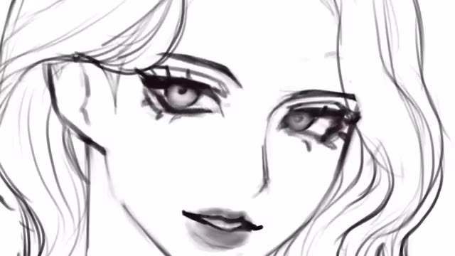
To start, I split my canvas into two sections. On the left side, I sketched out my usual edgy style, characterized by emotionless eyes and a somber color palette. My characters typically have a gothic look with dark, sultry makeup and an overall gloomy demeanor. The eyes are half-lidded, creating a seductive, almost lethargic appearance. For the anti-style on the right, I aimed to make a dramatic contrast by focusing on brighter colors and softer features.
Transitioning to the Anti-Style
I began the transformation by flipping my original sketch and using it as a base. Using the liquefy tool, I made adjustments to the eyes, enlarging them to create a more friendly and engaging look.
Next, I updated the hair by adding bangs, which are typically absent in my usual style but provided a more approachable appearance here. The overall goal was to make the character look less melancholic and more inviting.
Coloring and Rendering
When it came to coloring, I completely changed my approach. Instead of my usual dark, intense hues, I used desaturated pastel colors.
For shading, I added a new layer and used a soft brush to gently blend colors, which transformed the stiff, harsh shading into a much smoother and softer appearance. Highlights were added to the cheeks and lips to enhance the character's plumpness and warmth. I also experimented with new techniques, like using a soft light layer with orange hues to create a delicate glow.
Adjusting the Anti-Style Elements
To further refine the anti-style, I focused on making the line art more colorful. Instead of the usual black lines, I opted for light pastel colors, which complemented the softer color palette. I added accessories like a cute pin and a star earring to enhance the character's cheerful vibe. The background featured a repeating pattern of hearts, reinforcing the playful, kawaii theme.
I also incorporated more detailed shadows and highlights to bring depth and dimension to the artwork. This included adjusting the hue and adding soft, pink shadows for a more vibrant and lively look.
Final Touches and Reflections
In the final stage, I reviewed both versions of the artwork. My original style, with its edgy, dark aesthetic, remained intact, while the anti-style had evolved into a charming, pastel-colored piece with a soft, approachable appearance. The challenge of creating an anti-style proved to be an enjoyable exercise in creativity, pushing me out of my comfort zone and allowing me to explore new artistic techniques.
In summary, the process involved changing not just the color scheme but also the overall approach to features and expressions. By using different brushes, blending techniques, and color choices, I successfully created a contrasting style that was both refreshing and delightful. If you’re considering trying out an anti-style challenge, my advice is to use references and embrace the contrast to fully explore your creative range.
Feel free to share your thoughts on which style you prefer, and don't forget to check out my next video for more artistic adventures.